 Fellow Ringer The Hutt is back with their review of the last of the Extended Editions from Peter Jackson’s The Hobbit Trilogy. By now I would venture to guess many of you have had a chance to get your copy and have seen what has been added to this pretty awesome film. If you’re living outside the United States and are getting the UK DVD release then you will want to make sure you listen to how impressed The Hutt was with this final release.
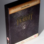
Hands-on review: The Hobbit BOTFA SEE (UK DVD) In the time of iTunes, digital copies and online streaming, it is quite a challenge to create a traditional home video release, especially if it has to have some appeal to collectors. One of the things that digital copies don’t provide is the feeling when taking a physical disc into your hand, or the satisfaction of having nice packaging for a film on your shelf. In this respect, the DVD editions of the Extended Editions of The Hobbit are pleasantly traditional, for (unlike the BluRays) they still have cool-looking covers and a fold-out digipak inside like in the good old LOTR SEE days. And among these DVD editions, the UK DVD version especially sticks out, for it uses a different design than the USA as well as most European countries: instead of a Photoshop collage it contains just the title and a minimalistic symbol, continuing the design tradition of The Lord of the Rings Special Extended Edition DVDs.
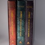
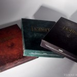
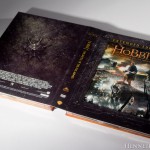
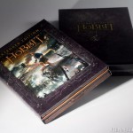
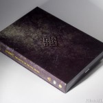
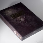
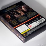
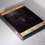
So after the third installment arrived from UK, we were eager to check it out! The cover is grey with a light purple hue. The upper/lower bar are parts of a so-called “C-Card” (a sheet of paper wrapped around the back and fold over the upper/lower edges of the front), attached with silicone glue points. 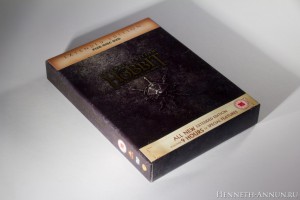 The back side contains the technical information. Note that the UK rating has been raised from 12 (Theatrical version) to 15. However, it is not because of the film, as we shall see later. The UK DVD is Region 2 and PAL, so it won’t be playable in non-modified US DVD players. The languages included are English, German, French and Italian. The title is debossed and has a gold texture. [ After removing the C-Card we see the splendidly manufactured outer slipcase. The symbol with the shield and swords is debossed as well. Also, the whole structure of the slipcase is rough and stone-like. The back side contains a dwarvish ornament, which is also debossed.
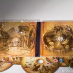
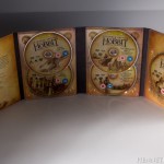
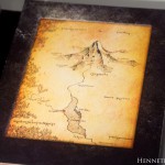
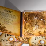
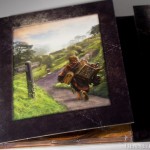
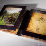
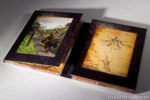 Now for the inner digipak (the cardboard foldout piece with plastic trays for the discs). It contains the same picture as the standard US DVD version. Actually, the inner digipak is the same as in the US version. The back of the digipak contains the same shield and swords symbol (non-embossed though) as well as the movie’s billing. The inner life of the digipak is also in tune with the LOTR SEE digipaks, containing an illustration and a map. The illustration shows Bilbo going Back Again. The map shows the surroundings of Erebor and the Long Lake and is inscribed in Elvish. Now for the inside of the digipak when fold out completely. It has a texture of old parchment and contains wonderful sketches by John Howe and Alan Lee. Unfortunately, there is no booklet. However, a matching fan booklet is already in the making. The discs also have those splendid sketches (unfortunately, there are rather distracting UK and EIRE age rating logos there as well).
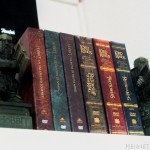
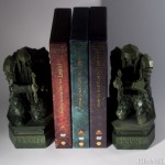
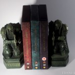
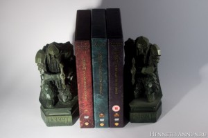
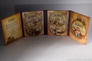 As you can see, the movie’s rating has not changed: it is still rated 12 in the UK. However, the first two bonus discs have been rated 15 in the UK! I think, because of a scene from PJ’s “Braindead” in the bonus. Now that all three films are out, it is time to look how they look together! And the first result is pretty convincing: they do look like they’re cut from the same cloth. Now for the side “shelf compatibility” comparison. Oh-oh, there is a BBFC logo on Film Three! Begone! Fortunately, it can be easily removed. Unfortunately, the title and the logos on the first film do not align properly with the other two films. For collectors suffering from OCD: if you turn the boxes around, it looks much better. And now for the ultimate test: the Middle-Earth Hexalogy on a shelf. Despite the mismatching alignment on AUJ, it still looks pretty good.
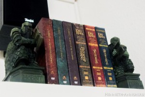 Final words: the UK DVD seem to be a worthy continuation of the tradition established with LOTR SEE in 2002-2004. The bar is very high, and it is not quite reached: the design of The Hobbit is not matching LOTR entirely; the misalignment on AUJ SEE is just unfortunate, and the omission of a booklet is a pity. Still, it is pleasant to see that at least in some countries Warner decided to go for a stylish packaging, almost reaching the perfection that was LOTR SEE. PS: I am aware that UK is not the only country with this cover design. It has also been released (at least) in Spain, Australia, New Zealand and Japan. However, UK ought be the best choice for most Europeans, and the price of just 15 pounds is just excellent value for money. You can get the UK DVD at Amazon.co.uk. PPS: Beware of the DVD trilogy boxes! They include just the fold-out digipaks in a large triple case, not the outer digipaks for the single parts!


