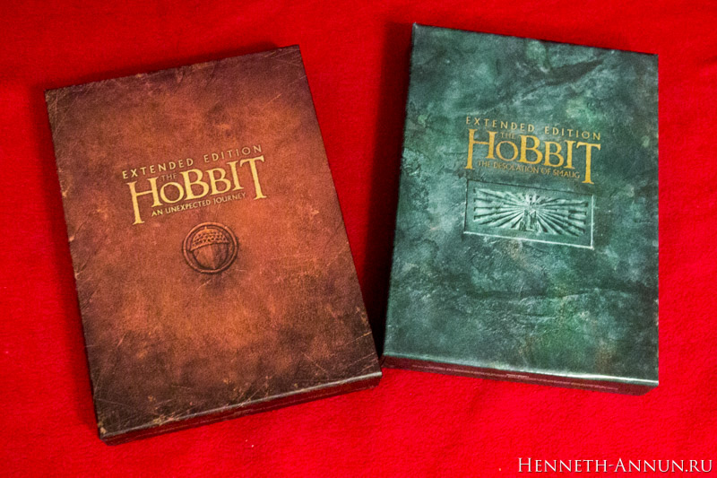
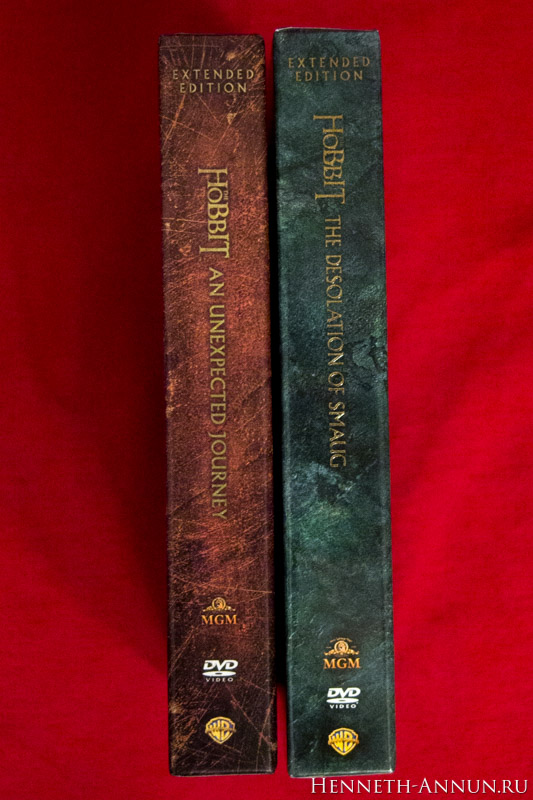
So far, so good. Now for the king discipline: how well can Warner handle continuity? We put the boxes of The Hobbit: An unexpected Journey and The Hobbit: The Desolation of Smaug together to compare them. After all, in New Line Cinema’s time and age, they managed to maintain a continuous design across three years.
The first glance from the front looks good, the editions fit each other optically quite well.
But the second glance from the spine reveals an utter disappointment. Warner UK, who is your designer? Fire him at once. The logos aren’t level with each other! The titles are misaligned, the logos are misaligned, and The Desolation of Smaug box is two millimetres taller than the one for An Unexpected Journey! This is sheer ignorance.
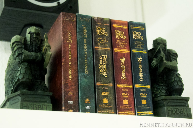
After all, how will these collector’s boxes stand in the shelf? Somewhat like this. And you can see how disordered the “Hobbit” side is; whereas, the “Lord of the Rings” side looks perfectly consistent.
Final words. The box looks really really great for itself. However, Warner Bros.’ designers seem not to know who their target audience is: collectors! Such an ignorance is really annoying — although the rest of the work is great.
Somehow it feels symptomatic to Warner Bros.’ attitude towards the whole “Hobbit” project, as opposed to New Line’s towards The Lord of the Rings.
TheHutt is chief editor at Henneth-Annun.ru, the Russian LOTR/Hobbit website. He is also known in Tolkien fandom for creating the fonts Ringbearer and Aniron, which are inspired by the original fonts used in The Lord of the Rings movies.
These views are his own and do not necessarily represent those of TheOnering.net, or its staff.


